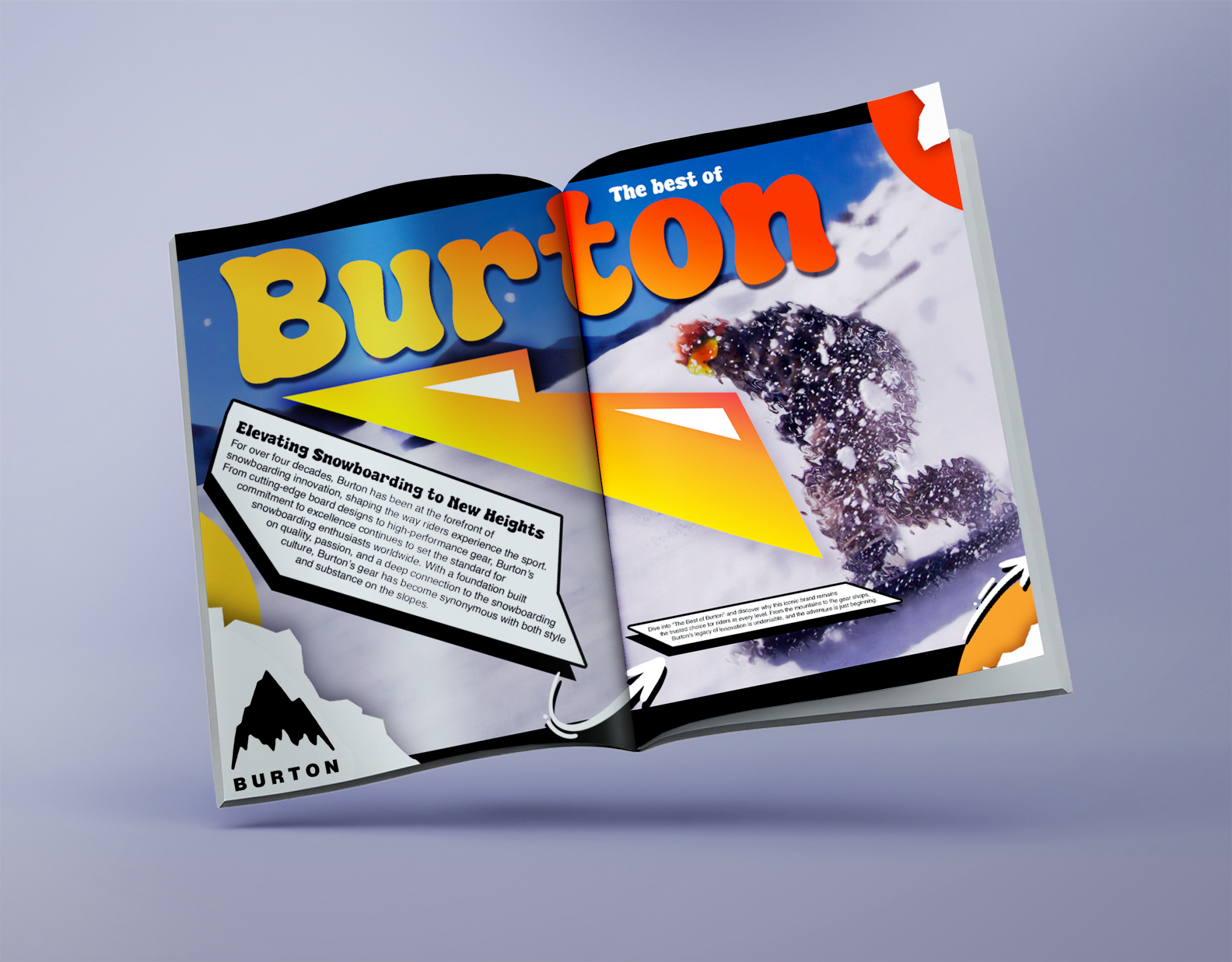
Burton is well known in the action sports space with their bold artwork tattooing snowboards & the like all across America & other countries. One of the driving forces behind Burtons creative is their wide use of logos or brand markings throughout the years, in fact, they’ve had no fewer than 100 logos or brand marks. Below are a “few” of them.
![]()
Concept
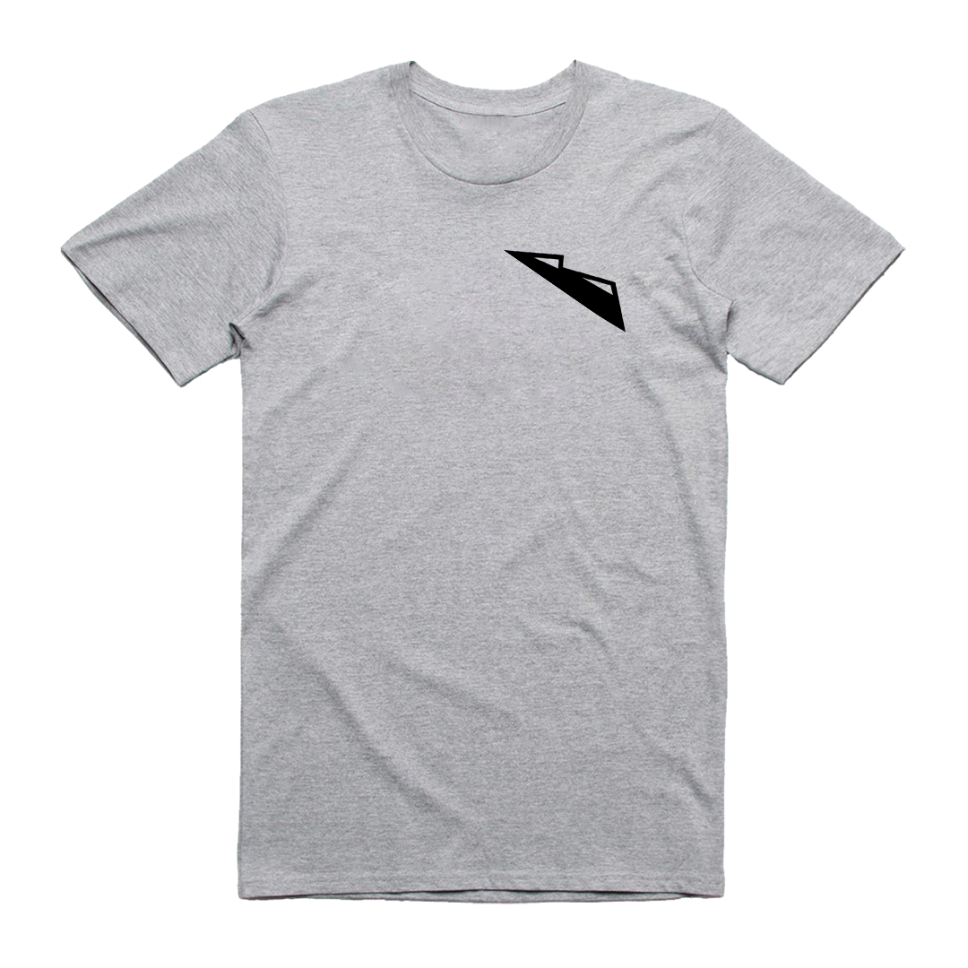
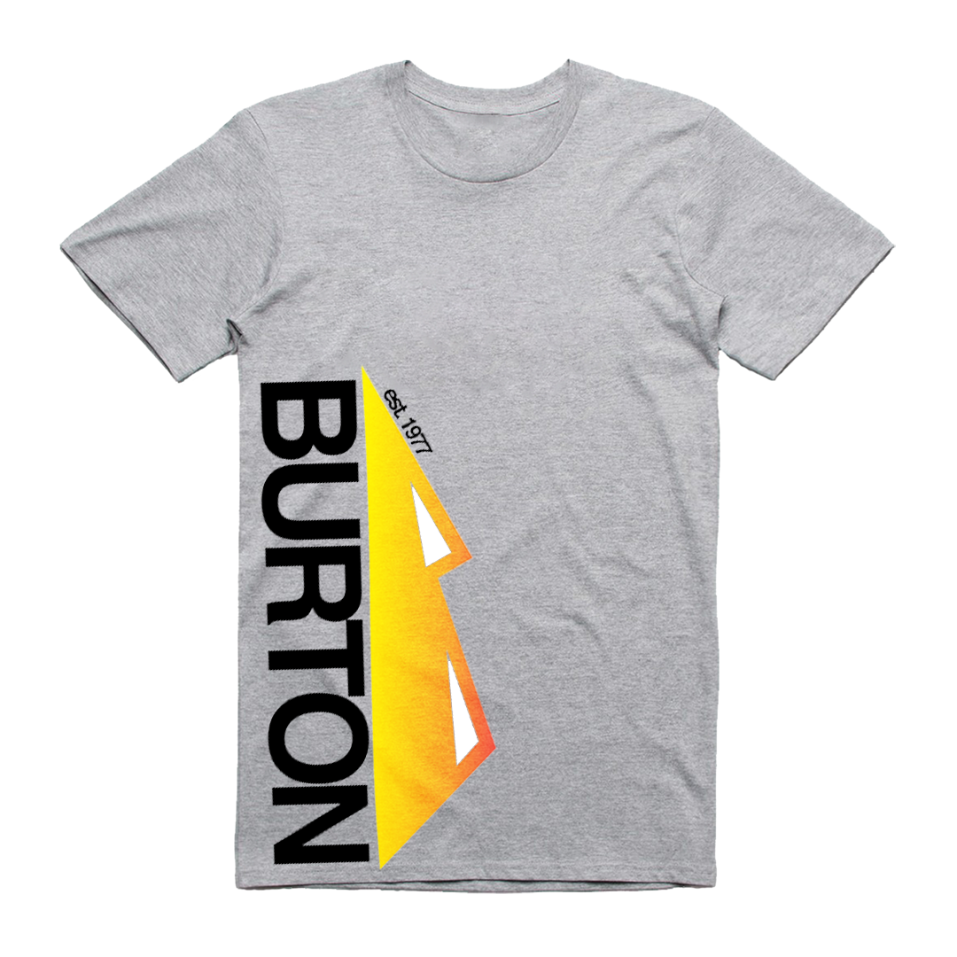
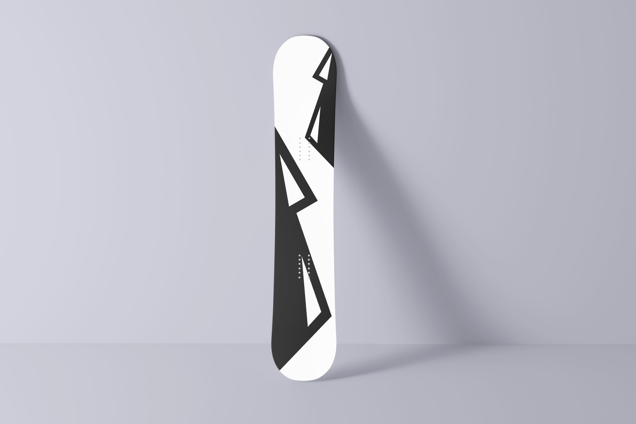
This concept combines the letter ‘B’ with mountains using a minimalistic approach. The mountain has been a staple in Burtons branding since their inception in 1977. As such, I wanted to keep the mountain intact while combining it with the letter ‘B’.
The top peak is not lined up with the mountain, but lined up with the other peak. This is a design choice. After testing with the peak lined up, having it not lined up was more natural.
Burton currently uses “Helvetica Now” as their typeface.
I chose Helvetica Bold with custom tracking as this brand marks typeface.