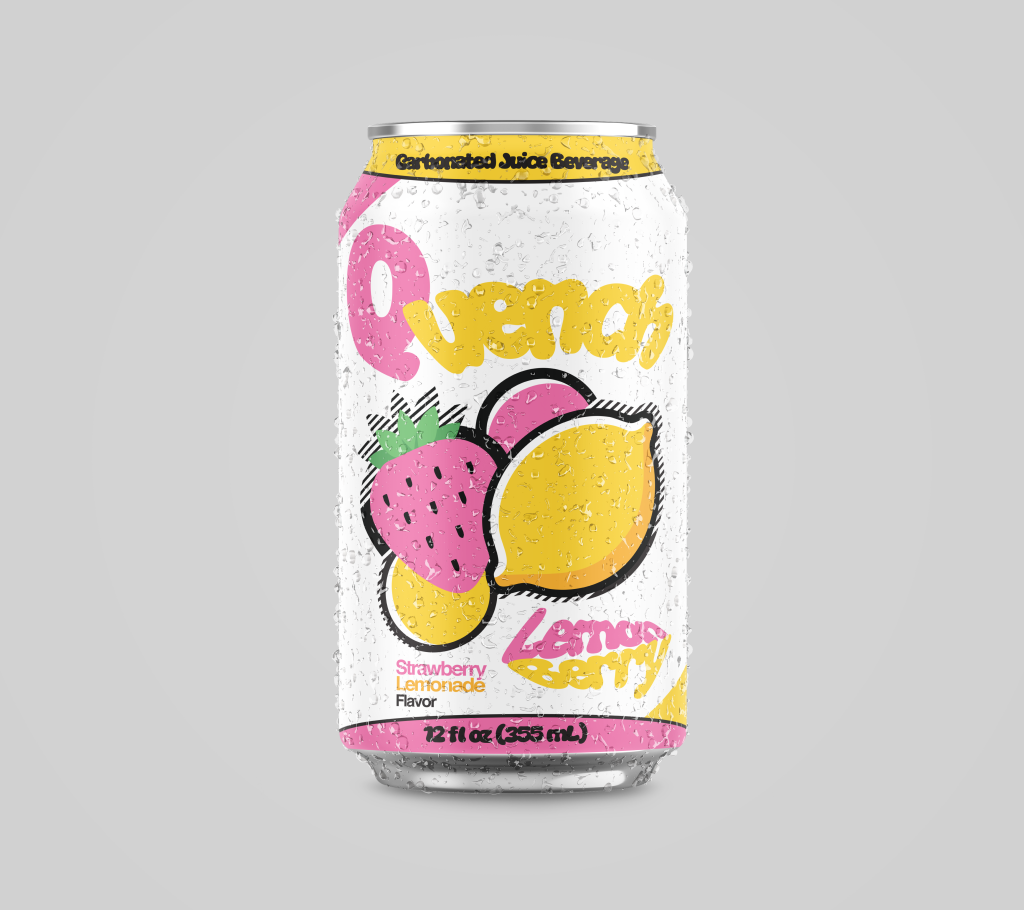
Quench Brand Identity Case Study
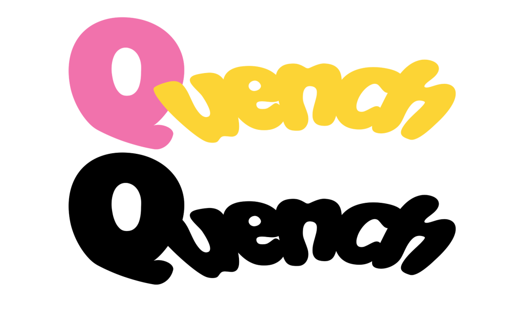
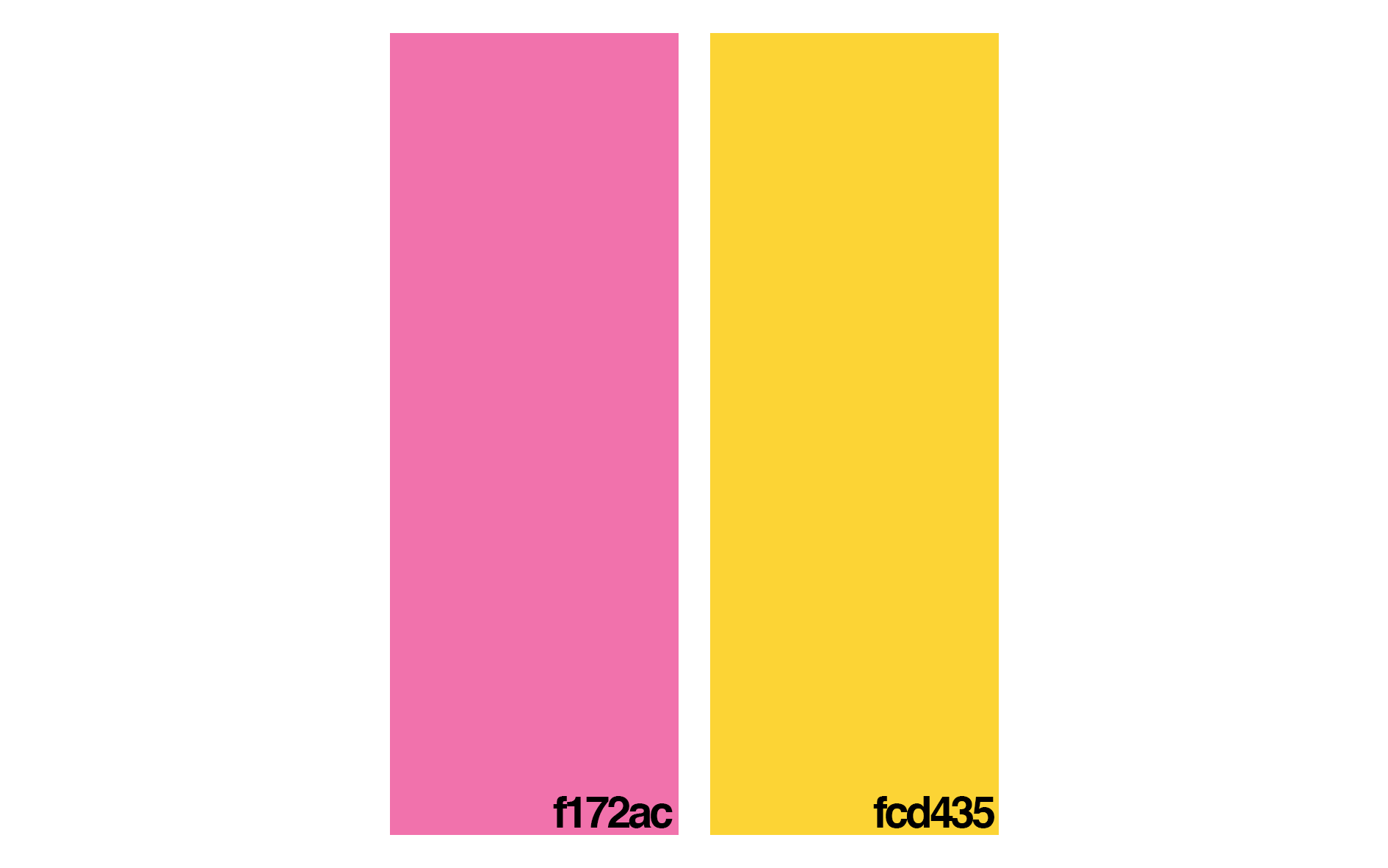

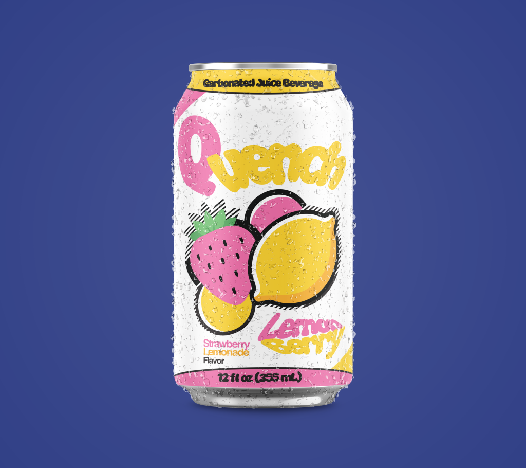
Quench is a fictional beverage company created to showcase brand identity as well as restaurant & beverage packaging design.
the first flavor announced by Quench was an iteration on Strawberry Lemonade, titled “LemonBerry“. So far, we have a strawberry and a lemon. Pretty straight forward, right?


Continuing with this idea, minimal shadowing & lighting were added to the lemon.
pink & yellow bubbles were added in the background


lemonberry flavor identity complete. now lets look at different typefaces that could suit the design.
